
A mobile washroom-finding app that helps people navigate the city with less stress and more confidence.
TEAM
4 Grad Students
UofT MI, UXD
TIME
Sep-Jan 2025
14 weeks
TYPE
Graduate
Course Work
ROLE
User Research,
Prototyping & UI Design
Context
Public washroom access is an everyday challenge shaped by urgency, mobility, and medical needs, yet the available tools offer little reassurance. As a team of four UofT MI students, we aimed to close the gap between what people need from a washroom and what they can actually know before arriving.
Problem
In Toronto, access to public washrooms is harder than it should be. People cannot quickly and confidently find public washrooms that meet their needs, because existing tools provide vague, unreliable, and incomplete information.
Solution
We designed a mobile app, GoAble, that helps people quickly find washrooms that match their preferences and accessibility needs. GoAble is designed with a lightweight contribution flow that encourages users to confirm conditions, report issues, and improve the quality of washroom information over time.
HOW MIGHT WE...
How might we help people find, trust, and contribute to public washroom information so they can confidently find one that fits their needs?
SOLUTION
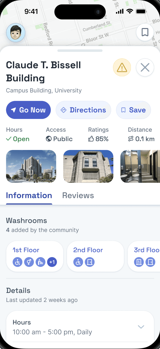
GoAble was designed to support three core moments in the washroom-finding journey:


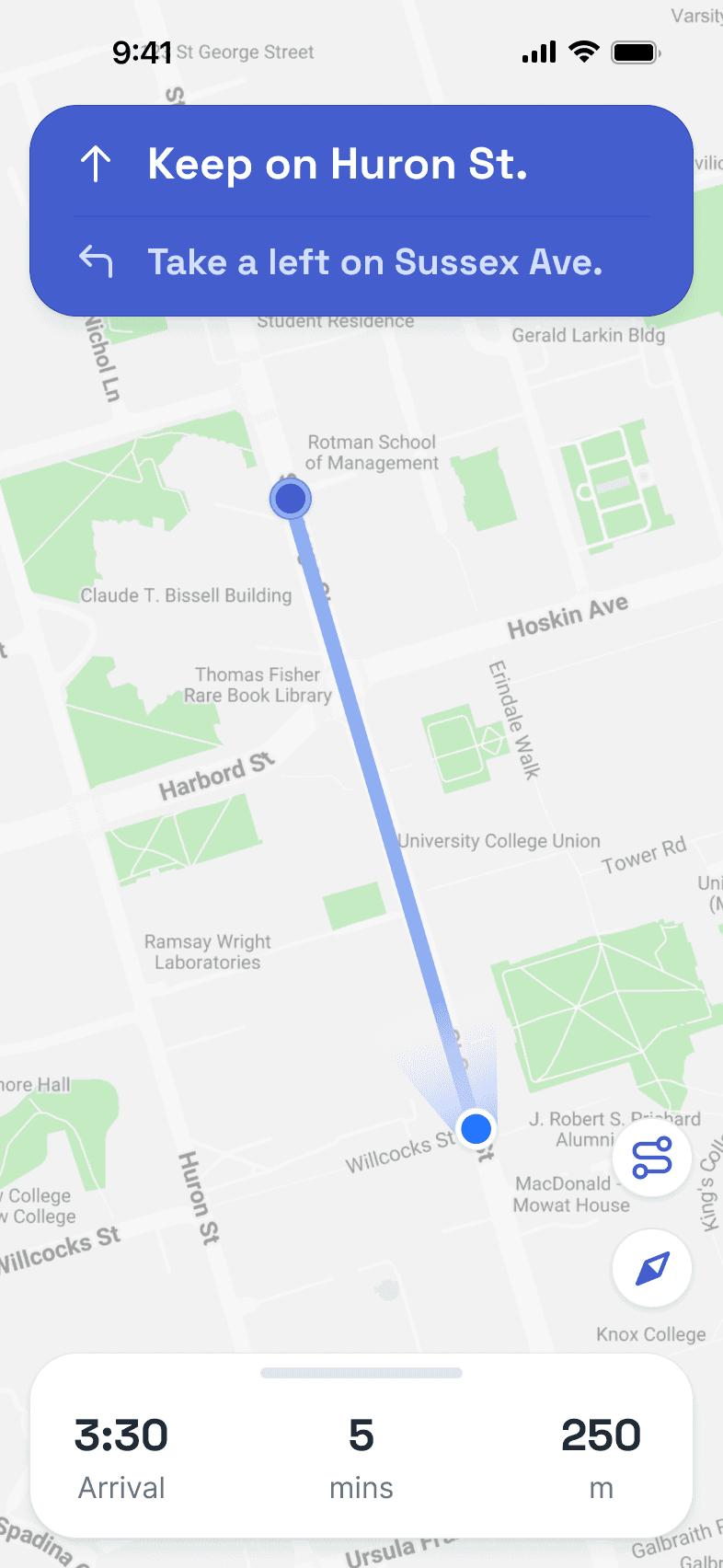
Finding a suitable washroom, fast.
Essential details at a glance:
Washroom Type
Availability
Distance
Access Features
Opening on a map-first home screen lets users scan options quickly without jumping between views.
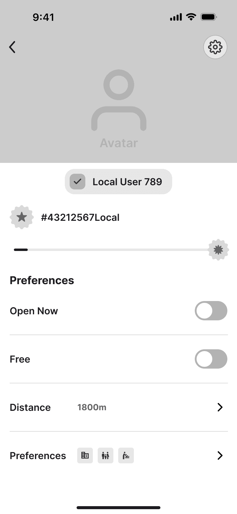
Simple filters quickly narrow the search, while location cards present details that matter most right away.
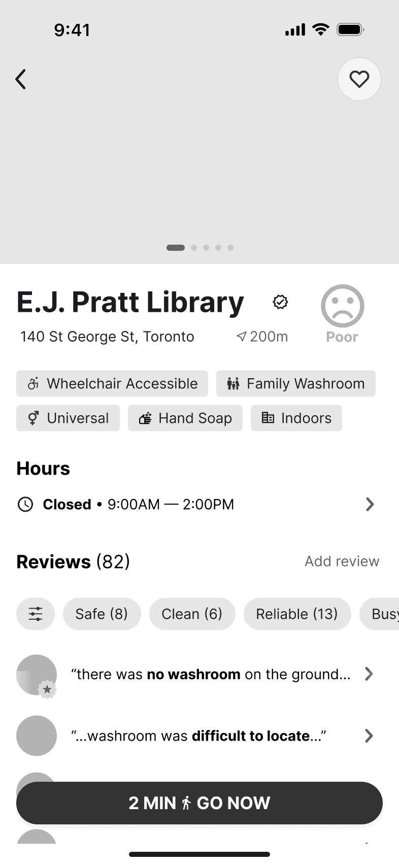
Choosing with confidence.
All in one place:
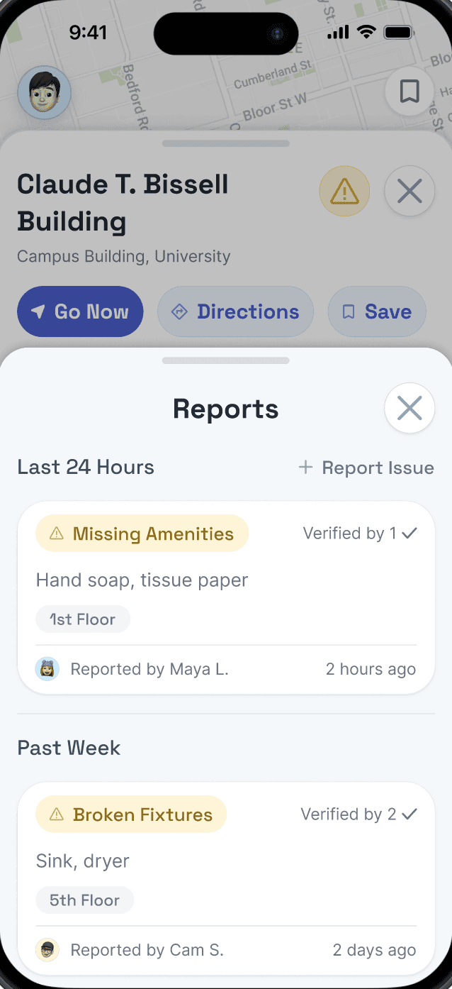
Key Details
Issue Reports
User Insights
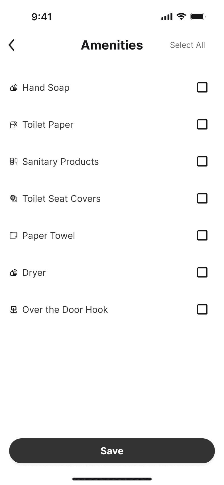
Amenities
Hours, photos, key features, and issue reports are shown together, and washrooms within the same building can be narrowed based on specific needs.
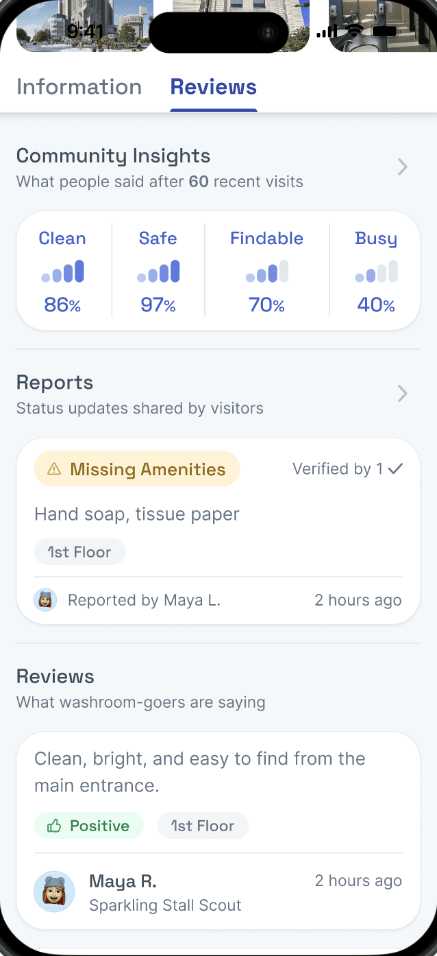
The reviews tab builds trust through recent visitor feedback and community insights.

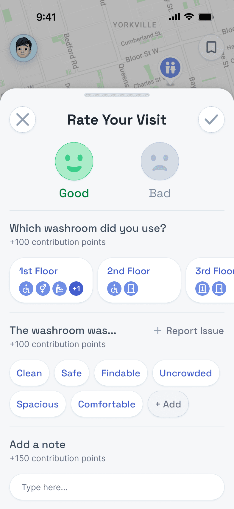
Contributing to better community data.
Designed for contribution:
Quick Reviews
Points Earned
Report Issues
Badge Progress
Post-visit contribution is intended to be quick, guided, and rewarding.
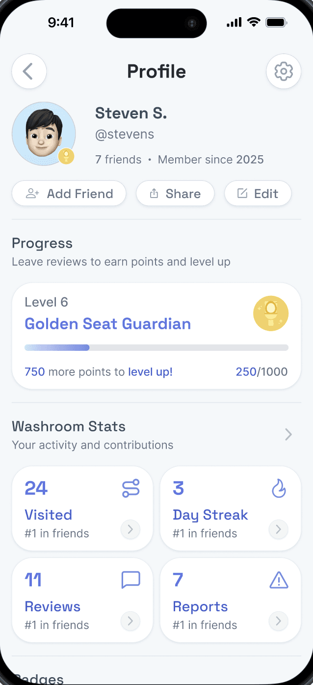
Users can quickly leave a structured review, flag issues with just a few taps, and instantly view their points and badge progress, helping to maintain up-to-date washroom information for the next user.
SECONDARY RESEARCH
In Toronto, the issue is not just finding a nearby washroom, it's knowing whether that washroom is actually usable. City-run washrooms may have limited hours or seasonal closures, while business washrooms often come with ambiguous access conditions. One Toronto study found that nearly 38% of surveyed cafés and fast-food restaurants had “customers only” washroom rules, rising to 47% among chain businesses.
This creates uncertainty for everyone, but especially for people with mobility impairments, people with strollers, and people facing medical conditions like IBS, where urgency and accessibility needs make “just finding another one” unrealistic. New solutions would have to help users understand whether a washroom is not only nearby, but actually usable.
Competitive Analysis
To identify market gaps, I analyzed three washroom-finding tools accessible in Toronto. Across all three, a consistent trade-off was apparent:
Some tools provided more ▲ reliable data but had ▼ limited coverage, whereas others offered ▲ broader coverage at the expense of building ▼ reliability and trust.

Washroom Map
Strengths:
Lists high-trust, official city-owned washroom data
Up-to-date alerts and status information
Weaknesses:
Narrow scope (city-owned only)
One-size-fits-all accessibility filter

GoHere
Strengths:
Lists high trust, partner-backed washrooms
Created for users with Crohn's and Colitis
Weaknesses:
Institution-listed locations only, leading to narrow scope
No user reviews or contributions
Toilet Finder
Strengths:
Broad location coverage across Toronto
Community-submitted washroom listings
Weaknesses:
Many empty listings, difficult to find what to trust
No incentive for accurate listings
SURVEYS
To understand how people decide whether a public washroom is usable, we conducted an online survey with over 50 respondents. Participants included everyday public washroom users as well as those who experience added barriers, such as accessibility needs, urgent washroom needs, or difficulty navigating public spaces.
Key Survey Insights
People do not feel confident finding a usable washroom.
3%
of respondents
felt confident they could find a suitable washroom in public when leaving home.
People trust other users’ washroom experiences.
80%
of respondents
said they were somewhat or very likely to trust user reviews about a washroom’s accessibility.
Users need practical details, not just locations.
Top usability factors:
Cleanliness (97%)
Clear signage and directions (62%)
Automatic/touchless doors (50%)
Users want proof before choosing a washroom.
Most helpful decision cues:
Photos of the washroom (71%)
Cleanliness ratings (68%)
User-written reviews (53%)
USER INTERVIEWS
We conducted 10 semi-structured interviews to explore how people locate and utilize public washrooms. The discussions centred on daily washroom-search behaviours and the obstacles faced by individuals in Toronto with urgent needs, mobility issues, or accessibility challenges.
Interview Participants
Interview Findings
Interviews revealed that users require more than just a map of nearby washrooms. They need enough details to determine if a washroom will meet their needs before arriving. As a result, community updates, reviews, photos, and issue reports became core elements in GoAble’s development.
Suitability was often discovered too late.
Participants said they could not always tell in advance whether a washroom was clean, accessible, open, or available without being a customer.
Broad labels created false confidence.
Terms like “accessible” or “public” sounded useful, but rarely explained what was actually there. More specific terms are needed to judge suitability.
Many chose discomfort over unpredictability.
When washroom options felt unreliable, participants described holding it in, avoiding public washrooms, or feeling stressed while searching.
People wanted to decide independently.
Several participants said they preferred not to rely on staff or strangers, especially when their needs felt urgent, personal, or hard to explain.
RESEARCH ARTIFACTS
User Personas
We created two personas to anchor the product around two different needs: urgent access and specific accessibility needs.

Journey Map
We mapped Steven’s experience to show how missing details can turn a simple outing into a stressful search.
DESIGN CHALLENGE
Designing for quick decisions and low-effort contribution.
Users needed fast access to nearby washrooms, but the product also depended on clear details, trustworthy reviews, and simple ways for people to report updates.
USABILITY TESTING
User Task Flow
This initial task flow mapped the core journey of finding a suitable washroom as quickly as possible from opening the app, to selecting a location, navigating there, and leaving a review.
At this stage, the flow focused on the shortest path to a decision and did not yet include additions like issue reporting, which were added in a later iteration.

Mid-Fi Wireframes
We used these mid-fi wireframes in 8 remote usability tests to evaluate the core washroom-finding flow before moving into the final revised UI.

KEY REVISIONS
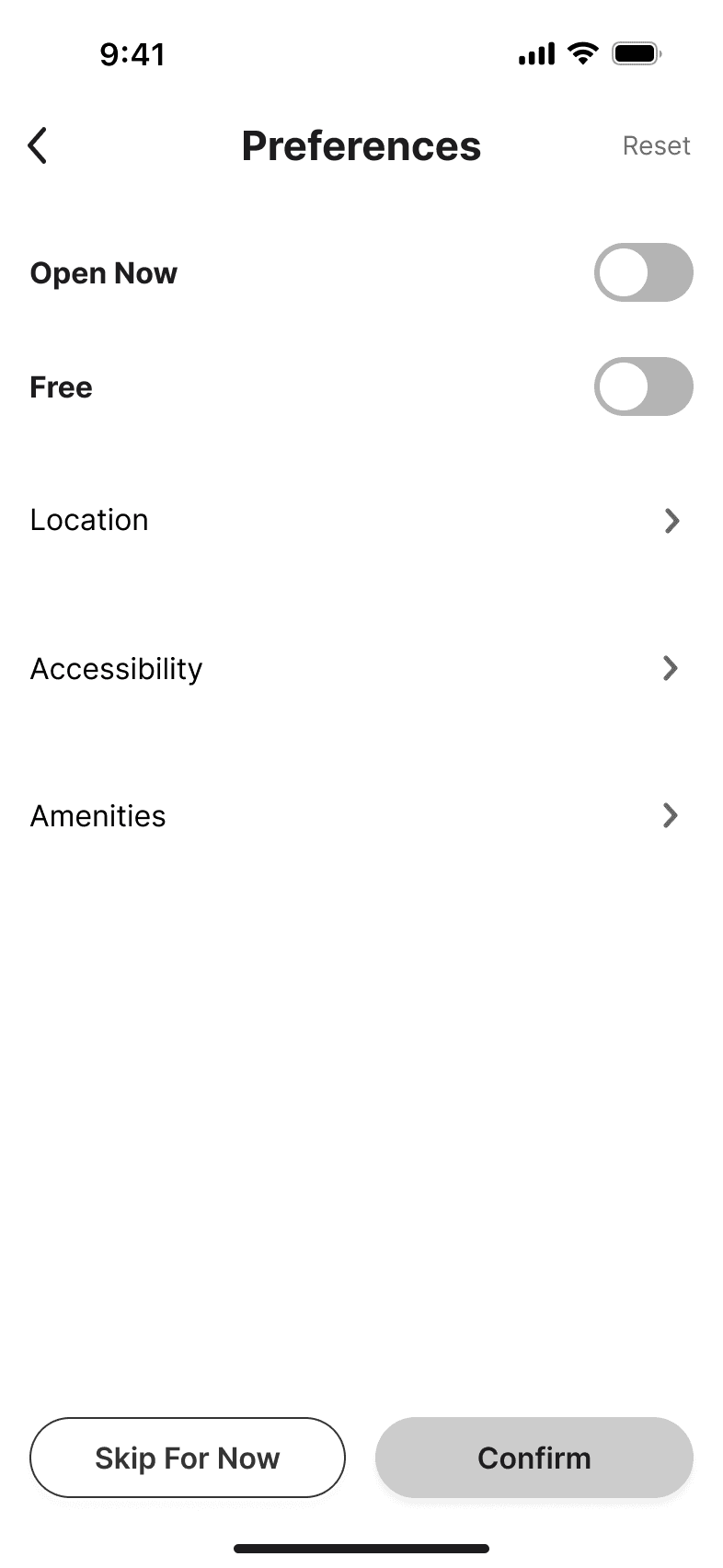
FILTERS
Before
5 of 8 participants found the filter system confusing.
Users didn't understand what "Verified" meant or who verified it.
"Amenities" like "hand soap" felt like baseline expectations, not filters worth selecting.
Long, multi-word tags like "Wheelchair Accessible" and "Baby Changetable" made scanning slow.
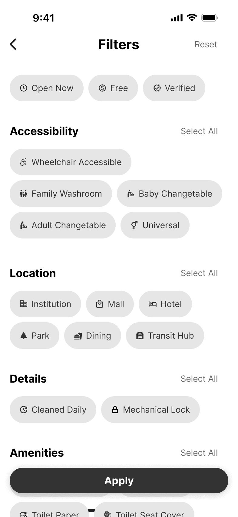
After
Restructured around user intent, not data attributes.
New top filters: "Top-Rated" and “Recently Reviewed”.
Amenities section removed, as soap and toilet paper are assumed, not filterable.
More meaningful grouping, 5 categories collapsed into 2.
MAP VIEW
Before
3 of 8 participants showed confusion around map pins.
Participants did not understand what the "X" and checkmark states meant.
The connection between a selected pin and its washroom card was unclear.
Pins gave little context about what kind of location the washroom was in.
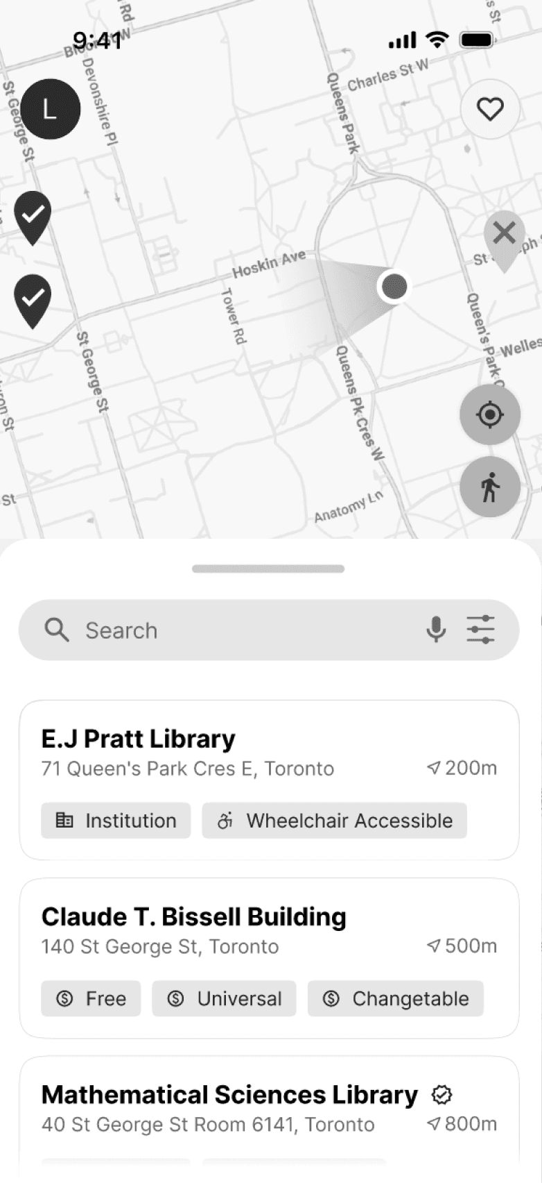
After
Clearer map pins with stronger location context.
Pin icons reflect the type of location, such as public washrooms, institutions, stations, or restaurants.
Tapping a pin expands the bottom sheet to preview the linked washroom card, strengthening the washroom-to-pin connection.
WASHROOM INFO
Before
4 of 8 participants felt key details were lost in clutter.
Important details were mixed into a long wall of tags.
Users were unable to select specific washrooms within the same building.
Reviews added extra scrolling, even though many users skipped them.
Basic items like toilet paper and soap felt redundant as tags.
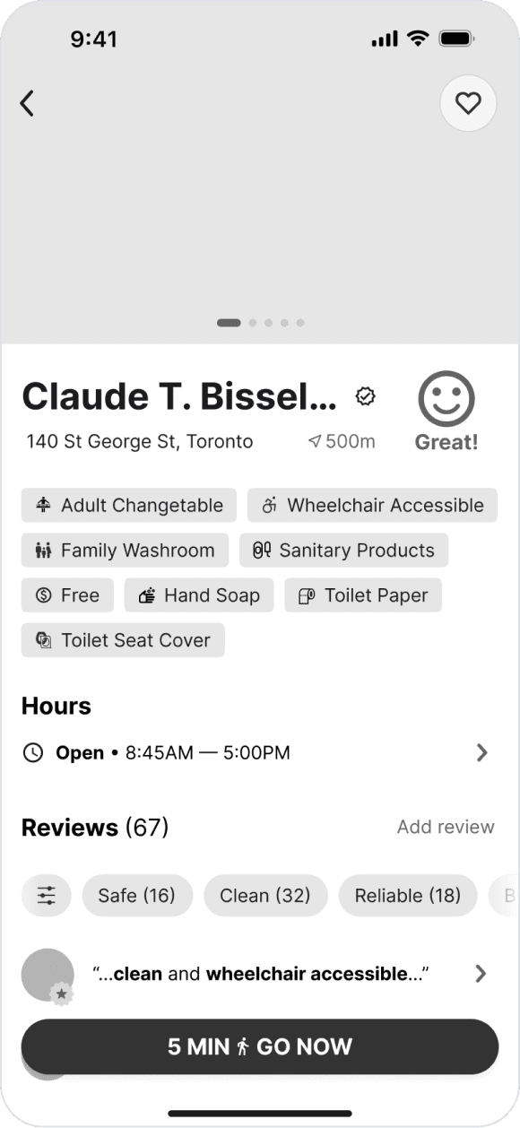
After
Reorganized the page around what users need to decide.
Key decision cues moved to the top (access, rating, distance)
Users can choose between specific washrooms within a building.
Reviews moved into a dedicated tab.
Expected essentials moved into issue reporting, where missing items are more meaningful to track.
REVIEW FLOW
Before
7 of 8 participants were hesitant to leave a review.
Many said they would only review after a notably good or bad experience.
5/8 users said they would skip reviewing if it took more than one step.
The effort felt too high for the perceived value in return.
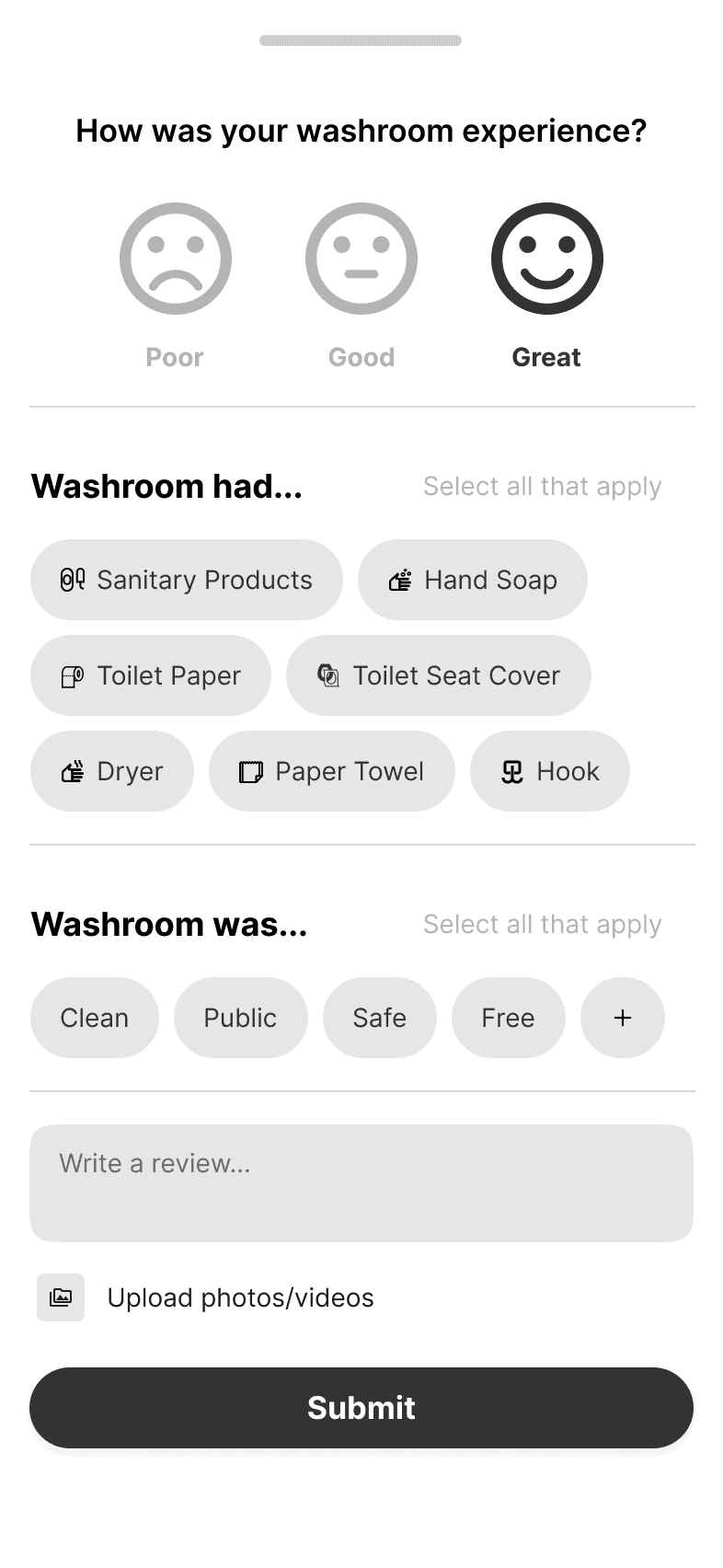
After
Simplified the review flow and made contribution more rewarding.
Simple Good/Bad choice.
Clearly shows the points earned for contributing.
Issue reporting option for missing or negative conditions.
FINAL DESIGNS


REFLECTION
Lessons Learned
Simplicity has to be intentional.
More information does not always make a product more useful. For a utility app, especially one used in urgent moments, the challenge is deciding what appears first, what stays secondary, and what only shows up when needed.
Trust depends on how people contribute.
Community input has to be designed carefully. If users are expected to leave reviews or update information, the flow needs to feel quick and meaningful. Reviews, reports, points, and progress are all needed to show users that their input could help the next person.
Learning from lived experiences.
This was my first full-process UX project, and it pushed me to design for users with needs very different from my own. Through interviews and testing, I learned how urgency, mobility, accessibility, and uncertainty shape people’s behaviour in public spaces.
Next Steps
If GoAble became a real product, the next challenge would be making the system reliable at scale.
Scaling through partnerships.
A stronger version of GoAble would need support from the places that directly manage washroom access. We would explore partnerships with local businesses, nonprofits, and the City of Toronto services to expand coverage and keep listings more reliable over time.
Testing contribution over time.
The review and reporting system is central to making GoAble useful, but it would need longer-term testing to see whether users actually keep contributing. We would explore which rewards, prompts, and reporting flows feel motivating without making the app feel crowded.